At Kadence, we built Insights Plus to help companies answer complex workplace questions using their own data—without having to wrangle spreadsheets or guess at behavior patterns.
Over the past few months, I’ve worked directly with customers who had important questions about how their people were using the office. These weren’t theoretical—they were tactical, operational questions that needed real answers.
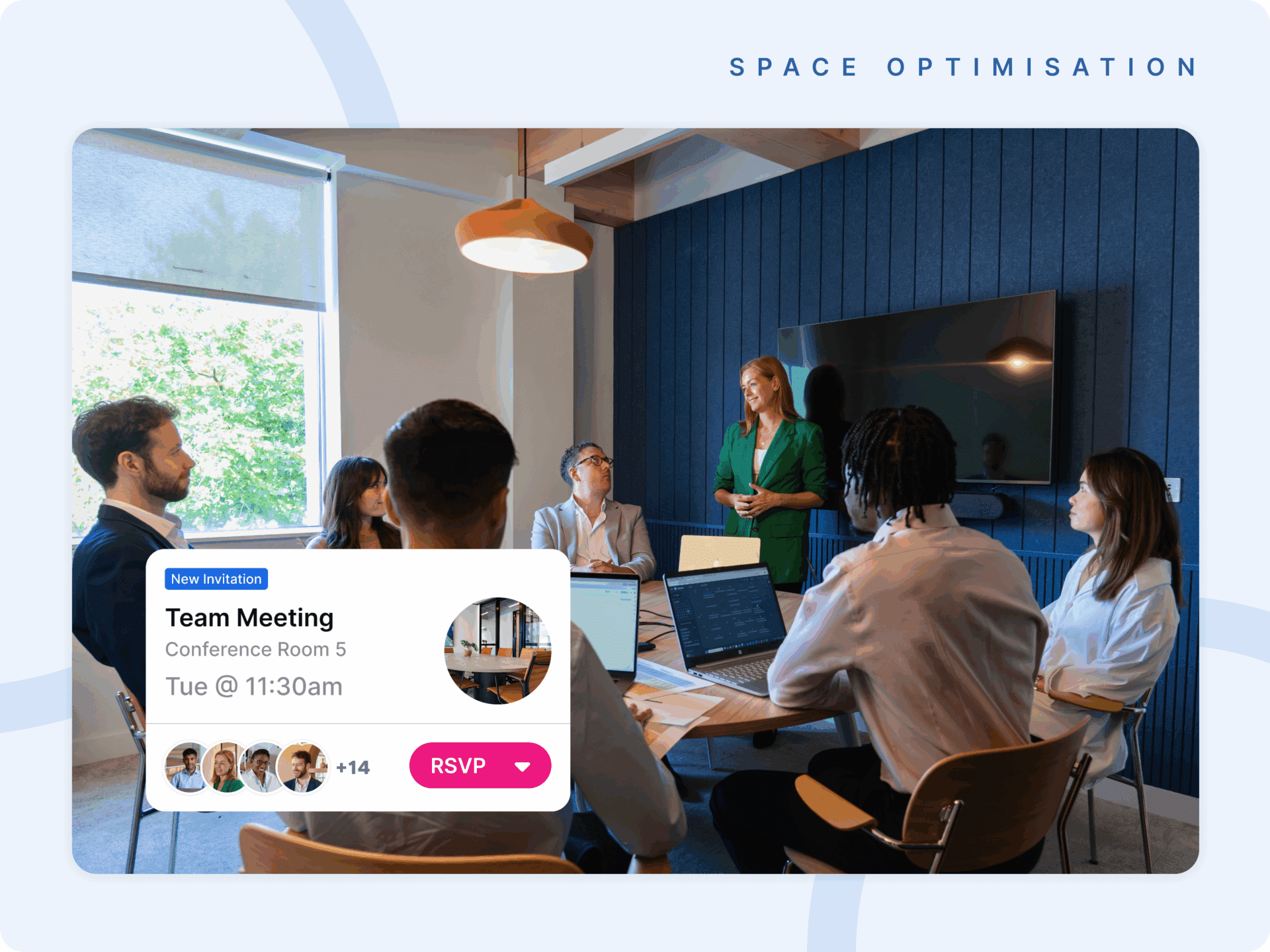
In this post, I’ll walk you through three actual dashboards we built in response to real customer needs, each focused on a different workplace theme: space optimization, hybrid compliance, and team collaboration.
Each one tells a story—and each one shows the difference it makes when your data actually works for you.
1. Can We Save Energy By Closing A Floor On Low-Occupancy Days?
The first dashboard came from a customer managing multiple buildings across global offices. Their question was simple: Could we reduce energy costs by shutting off an underused floor on quiet days like Mondays and Fridays?
With Insights Plus, we analyzed desk bookings by location, then zoomed in on one building in New York. What we found was a clear trend: Floor 1 consistently had very low occupancy—just 10–15%—on Mondays and Fridays, while Floor 2 stayed closer to 60%.
Using average booking counts and total desk capacity, we showed that the 20–25 people using Floor 1 on low days could comfortably fit onto Floor 2 without disruption.
Then we looked at behavior. Were these bookings random? Turns out, a few employees were regularly booking on Mondays. This wasn’t noise—it was a pattern. That gave the workplace team a path forward: speak with those individuals, understand their needs, and coordinate the change with confidence.
Insights Plus enabled:
- Floor-level occupancy comparisons
- Capacity validation
- Identification of habitual users
- Evidence-based support for energy-saving decisions
2. Are Employees Following Our Hybrid Policy?
The second dashboard was inspired by some of our customers. They weren’t just tracking attendance—they wanted to know how well people were aligning with hybrid expectations. Who was consistently coming in? Where were patterns shifting? Were policies being followed across locations?
We focused in on San Francisco. Employees had personalized in-office targets—some were expected two days a week, others three. We calculated not just weekly compliance, but overall adherence: had employees met the expected number of days across the period, even if some weeks were missed?
We then compared two employees on the same policy. One had near-perfect alignment—coming in three days most weeks. Another was more sporadic, averaging two days per week. Not a policy breach, but a difference in pattern—one that enabled a supportive, nuanced conversation rather than a binary judgment.
We also surfaced booking trends by day. Wednesday dominated, with over 60% of bookings—a signal that helped with resource planning and team alignment.
Insights Plus enabled:
- Flexible, policy-aligned compliance tracking
- Contextual behavioral comparisons
- Informed, team-by-team adaptation
- Day-level booking behavior visibility
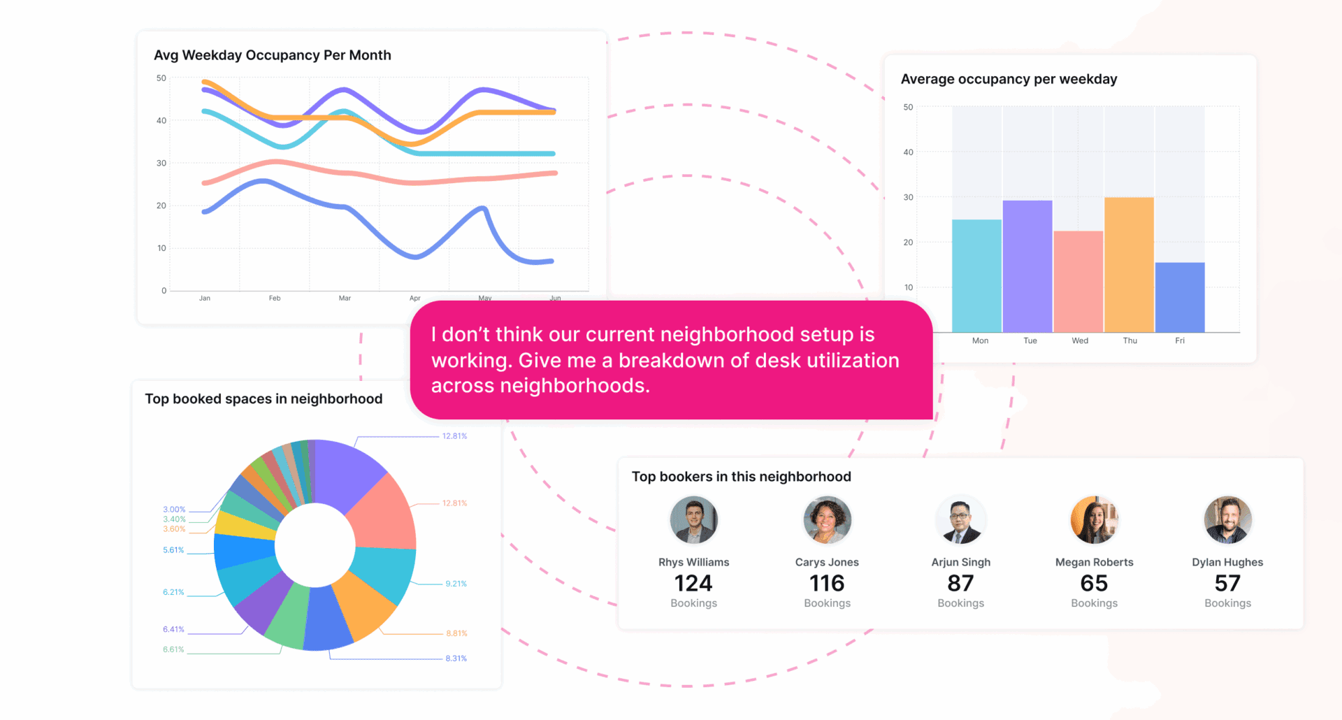
3. Are Teams Using Their Assigned Spaces And Coming In Together?
Finally, a question we heard from our customers GWI and PHSO: Are our teams really collaborating in the spaces we’ve assigned them?
This customer used a neighborhood model—dedicated spaces for each team. With Insights Plus, we created a view showing each team’s assigned neighborhood, team size, desk count, and co-booking rate: the percentage of bookings where multiple team members used their neighborhood at the same time.
Some teams, like Support, had 95% co-booking—a sign of strong coordination. Others, like Marketing, were closer to 30%, showing more individual use.
We spotlighted one team—HR—and tracked how many of them booked into the neighborhood together each month. We found a growing habit: attendance rose steadily from September to March, with clear peaks midweek.
We also added room booking data: when meetings happened, how long they lasted, how many teammates joined, and what time of day they occurred. The result was a full behavioral picture of how the team used space—not just desks, but rooms, schedules, and rituals.
Insights Plus enabled:
- Neighborhood co-booking analysis
- Temporal trends in team presence
- Correlation between desk and meeting activity
- Deep visibility into collaboration habits
From Data To Decisions
These three dashboards aren’t just analytics—they’re answers. And they represent the kind of clarity workplace teams need to make decisions that improve how their people work, not just where.
That’s what Insights Plus is for: actionable insight, made simple.
Want to explore how it could help your team? Book a demo with our hybrid experts today.